
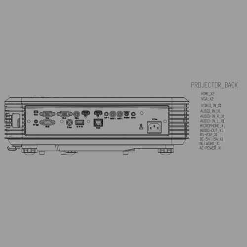
For this first task I we were asked to create a 2D model of something that related to the RSA project (at this point I had already found a CAD drawing of a projector that I was thinking about using so I used this). I then crated a block from this, I then added dynamic parameters. You can download the drawing here.
Click here to Download
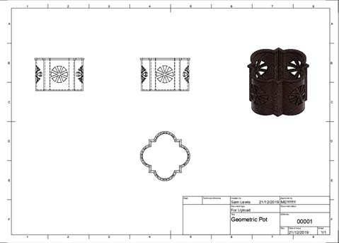
For this task I was asked to produce a 3D object from a 2D shape that was given to us. I completed this task using Fusion 360. The object that I produced was a small mahogany box / bowl that could be used to store a range of different items such as jewellery. To start I imported the image and used it as a template and then extruded up to make a bowl shape. I then changed the plane location and sketched the design I wanted, I then cut and extruded it all the way through to create the desired effect. After it was how I wanted it, I then added a material and finish for it to look realistic. From this I created a drawing with multiple views and filled in the title block.
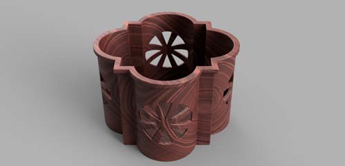
For this task I was asked to take the object that I made from the geometric shape and create a render and animation. In order to create the render, I opened the render menu in Fusion 360, found an angle I liked and adjusted the lighting accordingly. After this I rendered it in the highest setting possible. The animation was a little more complicated. Firstly, I created a quick wooden table, I then added the shape and a lamp from a previous task. After this I opened the animation menu and used the manual transform feature to choose a direction and distance for each item to travel. Finaly I added a camera movement and once I was happy with it, I downloaded it as an AVI file which I converted to a MP4
For this project we were given a choice of different client briefs that we could choose from. Our group went for one by King John’s House in Romsey. This was a small museum inside an old medieval cottage believed to belong to King John. I heard that the client once wanted to implement tablets but was this deemed too expensive and unpractical, from this I decided to implement QR codes around the museum. Doing this meant that I could bring the interactivity that the tablets would but at the fraction of the cost because I was using devises the visitors had brought themselves.
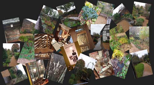
To start the project me and the group organised a visit to the museum in order to gain some context to the brief. Unfortuanatly only half of the group where able to attend the vist but we where able to gain a vast amout of reference images in order to help us with the project. To fill the others in we put all the images in a group chat and filled them in verbaly with all of the relevant information.
When I started creating my QR codes I noticed that the current logo that was being used on the website didn’t scale down well due to it being relatively complicated meaning that some of the smaller details would be tiny and illegible. During the visit I spotted a logo for the gardens engraved on a bench. The logo was minimalist and looked (in my opinion) more professional and modern. I used photoshop to trace it and put it into my work and branding for the house.

I wanted to find a font that found the right balance between medieval / gothic and also legible when it gets scaled down especially for people with sight difficulties. I started by filling a page with a range of different potential medieval style fonts and then scaled them all down to a smaller size. From this I was left with only 2, from these I chose what I thought was the most suitable.
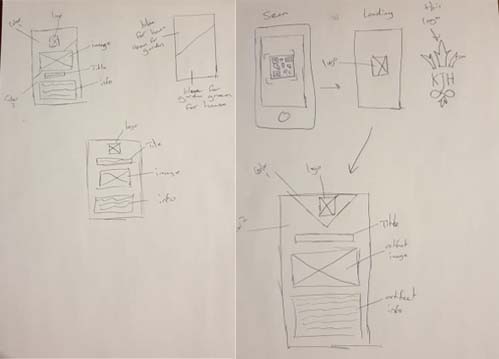
When looking at the marketing for the museum I noticed that the branding for the gardens and the museum itself seems to be kept slightly separate. I wanted to take this into account when doing the information displays. I had an idea to invert the colours in the background depending on where the QR code was. I wanted to have a modern and professional look so I went for a minimalist design. The sketches can be seen to the side, a simple wireframe can also be seen.
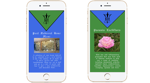
I mocked up my original design on photoshop and choose some suitable colours and quickly saw that the bold colours meant that the text was hard to see and it gave it almost a childish look, not what I wanted to go for at all. (I did this before I decided on my font)
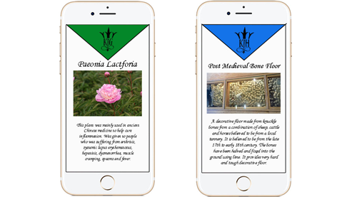
For the second attempt I decided to keep the background white but keep the triangular header colour. (colour still dependent on there the QR code is located) This gave off the look I wanted a lot more and the text was more visible due to the font and the fact it could be plain black. I decided to use this attempt to use on my QR codes.
I looked at a range of different QR code generators but none of them let me add my design of my info page. Due to this, I used a URL QR code and uploaded my design as an image to a cloud like service with a URL and added it to a QRcode. This is not the way I wanted to do it. The only other option was to pay for a subscription to a company. The second issue was that the cloud like software that I used wouldn't let me control the quality of the image to the information page making it blurry. Because of this I was only able to make a prototype of how the QR codes would work.
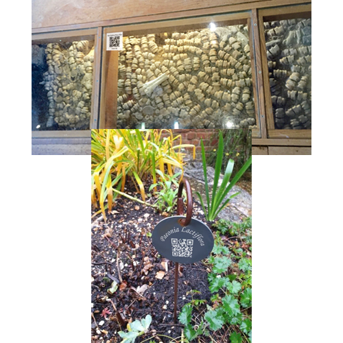
With my limited skills at photoshop I tried to show what some of the QR codes would look like in the real world. The images I produced are in no way perfect but I feel that it does give a good idea of how the QR codes could be displayed and still fit in with the aesthetics of the museum. I did one for the gardens and one for in the museum.
For this project I have chosen to investigate the RSA student design awards brief 6 - a platform for joy which asks for me to do research into how train stations can be made a more joyful experience. I have chosen to do this by adding elements of interactive entertainment around the platforms and looked at adding some elements of community such as markets and live music to some of the larger open areas. This addresses the brief since entertainment is known to have a positive effect on people resulting in a more joyful experience for those who get involved.
The initial inspiration for my idea was seeing what other countries were doing with their train stations. The main feature that had the biggest positive impact was hosting markets in open areas (main inspersion being Zurich train station in Switzerland) . I wanted to further this by adding other community focused activities to stations such as social areas, live music, performers, live music and more. But the brief stated that my idea had to be able to be implemented into smaller stations as well. Knowing this I realised the not all station has the space to have these activities, so wanted an additional idea that could be placed in the space of a small platform. This is when I saw an interactive projector being used in a fast food restaurant to play some simple games. This got me thinking about where I have seen them before. I remembered them being used in classrooms where it would make coming up to solve a question that little more interesting as we got to use “the cool board”. (making something mundane joyful)
This project appers less detailed than the others due to the fact that there is a downloadable pdf below that contains all of the information needed for this project. The link below will take you to a PDF of the full submition that has by project in full detail.
Click here to Download